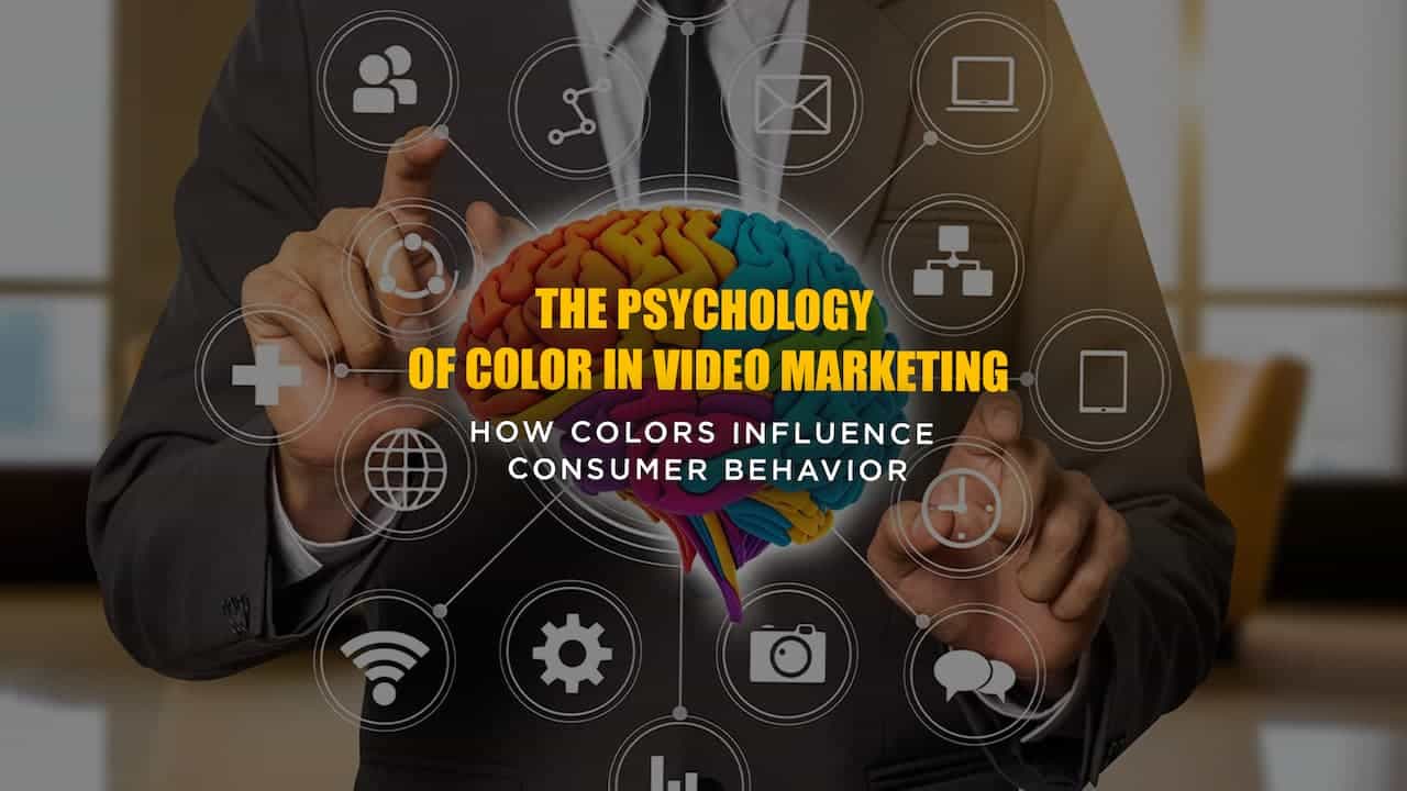
Why The Psychology of Color is Crucial in Marketing and Branding Videos
Have you ever wondered why certain brands stand out to you more than others?
Why does red catch your attention, while blue seems to calm you down?
The answer lies in the psychology of color. And when it comes to marketing and branding, understanding how different colors affect consumer behavior is crucial to create a connection with your audience.
This article explores the psychological effects of color in marketing videos, specifically how to use color to enhance your brand’s visual identity strategically.
Whether you’re creating a brand video, product promo, or social media content, leveraging the power of color can seriously elevate your marketing efforts!
Basics of Color Theory
What is Color Theory?
Now, before we dive into color psychology and the impact of color in marketing, let’s take a moment to revisit the basics.
Color theory is all about using colors in specific combinations that are visually appealing and emotionally impactful. It is the foundation for creating a harmonious and aesthetically pleasing visual experience. In marketing and branding, color theory helps guide decisions about which colors to use to convey specific messages, emotions, or actions.
Primary, Secondary, and Tertiary Colors
To start, remember that colors are categorized into primary, secondary, and tertiary groups:
- Primary colors—red, blue, and yellow—are the building blocks of all other colors.
- Secondary colors—orange, green, and purple—are created by mixing two primary colors.
- Tertiary colors, such as teal or maroon, are formed by mixing a primary color with an adjacent secondary color.
Understanding how to work with these groups can help you create a color scheme that aligns with your brand’s messaging while establishing a strong visual appeal.

The Color Wheel and Its Importance
So, we all remember the color wheel from back in the day, right?It’s a tool we’ve seen in school art classes, helping us understand how colors interact with each other—complementary, analogous, or contrasting. It’s a foundation that’s just as important when examining color in modern-day marketing materials.
The color wheel helps us visualize how colors relate to one another and guides the creation of harmonious color combinations. For example, complementary colors—those opposite each other on the wheel, like blue and orange—can create a striking visual contrast. Analogous colors—those next to each other, like blue and green—tend to create a more harmonious, cohesive look.
To bring this concept to life, take a look at how Pepsi uses complementary colors in its branding. The blue background contrasts with the red logo, making it pop and drawing attention. The combination of these bold colors creates an energetic and dynamic feel, which aligns with Pepsi’s goal of evoking excitement. You can see this in action in their 2024 Christmas ad, which features a lot of blue with vibrant red accents (and, of course, a touch of green for the holiday spirit):
In contrast, brands like Starbucks use analogous colors—green and brown—to create a more calming, natural vibe. The green in their logo blends seamlessly with the earthy tones of the overall design, helping to evoke feelings of harmony and relaxation, in line with their focus on organic and sustainable products. In their video marketing, you’ll see a cohesive approach with earthy color schemes, where a few subtle blue tones are woven in, but the overall feeling is very different from Pepsi’s approach:
Why Use Color Psychology In Video Marketing?
Now that we’ve covered the basics, let’s explore why color psychology is crucial when creating videos for your brand. Understanding how color affects human emotions and behavior can help you connect with your audience more effectively. Essentially, your choice of color in marketing and branding can influence how viewers perceive your message and take action.
Psychological Effects of Color
Color has a profound impact on how people feel, so understanding the emotional reactions different colors provoke can help you strategically use them in your branding videos to connect with your audience on a deeper level.
This chart illustrates some of the key emotions and behaviors associated with different colors:
| Color | Psychological Effect | Common Associations |
|---|---|---|
| Red | Energy, Urgency | Passion, Love, Danger, Excitement |
| Blue | Trust, Calm | Professionalism, Security, Reliability |
| Yellow | Optimism, Happiness | Attention-grabbing, Cheerful |
| Green | Growth, Balance | Nature, Health, Stability |
| Orange | Creativity, Fun | Youth, Playfulness, Adventure |
| Black | Elegance, Sophistication | Luxury, Mystery, Formality |
How Strategically Using Color in Marketing Influences Viewer Behavior
Colors don’t just influence emotions in the moment. They can also have a strong influence on viewer behavior.
Generally, cool colors (like blue, green, etc.) make people feel relaxed, encouraging viewers to slow down and not rush on a decision. Alternatively, warm colors generally push for a more immediate action.
Understanding these associations can help you optimize your video content to drive desired viewer responses.
Key Takeaway
Color psychology is the study of how colors influence emotions and decisions, making it essential in branding or marketing. For example, when you see the color orange, it may trigger a playful kind of urgency, while the use of purple can evoke mystery—both key in shaping viewer perception.
By understanding how color affects human response, marketers can leverage color psychology to drive engagement and storytelling in video content.

How to Build a Color Scheme for Your Video
Choosing the Right Color Palette Starts with Understanding Your Brand and Target Audience
If you haven’t developed your core brand colors yet, it’s essential to first understand your brand’s identity and values. Start by asking yourself key questions: What is your brand’s personality—are you playful and fun or serious and professional? What emotions do you want to evoke in your audience? For example, are you aiming for a friendly, approachable feel or a more professional, authoritative tone?
To dive deeper, consider conducting surveys or focus groups with your target audience to understand their color associations and color perception. You might also want to explore how colors are commonly used in your industry. Checking out your competitors and their color choices can give you some useful insights into what works well with your audience.
By understanding both the emotional response your brand aims to provoke and your audience’s color preferences, you’ll be able to choose the right color palette for your core branding.
Choosing Colors for Your Brand Content Based on Color Psychology
Once you have a clear sense of your audience and core brand color scheme, you’re ready to use color psychology to select the colors that will resonate most in your videos.
Check out the chart below for more industry-relevant color psychology suggestions:
| Industry/Brand Type | Recommended Colors | Emotion/Effect |
|---|---|---|
| Health & Wellness | Green, Light Blue, White, Earthy Tones | Calm, Trustworthy, Fresh, Natural |
| Technology | Blue, Black, Gray, Silver, White, Neutrals, Purple | Modern, Sleek, Professional, Innovative |
| Fitness & Sports | Red, Orange, Black, Gray | Energy, Power, Motivation, Strength |
| Food & Beverage | Orange, Red, Yellow, Green | Appetite, Freshness, Excitement, Warmth |
| Luxury/Fashion | Black, Gold, White, Deep Blue, Neutrals, Purple | Sophistication, Elegance, Prestige |
| Education | Blue, Yellow, White, Green | Trust, Knowledge, Clarity |
| Beauty & Cosmetics | Pink, Gold, Purple, Black | Feminine, Elegant, Luxurious |
| Finance | Blue, Dark Green, Gray, White | Stability, Trust, Authority, Security |
| Non-Profit | Blue, Green, Yellow, Warm Neutrals | Compassion, Hope, Trust, Empathy |
| Entertainment/Media | Bright Colors (Red, Yellow, Purple, Blue) | Fun, Creativity, Excitement, Energy |
Pro-Tip: Using a mix of complementary and analogous colors can help create a balanced and effective palette.
For even more inspiration, explore a color palette generator like coolors.co.
How to Use Color Combinations Effectively
Color combinations are a vital tool in creating visually appealing and engaging video content because the way you combine colors can significantly impact how your audience perceives the message you’re trying to convey. One of the most effective ways to draw attention and create visual interest is by using contrast strategically.
Whether it’s pairing light and dark colors or mixing warm and cool colors, the right combinations can make key elements stand out and guide the viewer’s eyes where you want them to go.
When using color combinations, experiment with different pairings to see what works best for your video’s tone and message. Consider how the primary and accent colors interact with each other. Do they complement each other for a harmonious feel, or do they create a dynamic contrast that draws attention? A well-thought-out color scheme can not only enhance the visual appeal of your video but also help reinforce your brand’s message by ensuring the right focus and emotional impact.
Key Takeaway
Color Psychology In Marketing: A Pixelab Studios Case Study
In one of our commercials for Crews Control LLC, our primary subjects were flaggers wearing bright yellow and orange safety vests. While these colors were not an intentional part of our original design, we decided to embrace them and use them to our advantage in the scene.
Working with Unintended Color Choices
Instead of trying to obscure the bright vests, we worked with the color palette already present by using a dark, cool blue background to create contrast. This helped the flaggers stand out against the background, but we also made sure to include some additional elements to enhance the scene.
These included orange traffic cones and bright lights strategically placed in the scene to direct the viewer’s eye toward the center of the frame, where the flaggers were positioned. These color choices not only complemented the orange in the vests but also helped create a visual flow that kept the viewer’s focus where we wanted it.
The Power of Complementary Colors: Blue and Orange Contrast
The blue background served as a complementary color to the warm orange tones of the vests and cones, creating a balanced yet dynamic composition. This contrast made the scene visually striking and ensured that the flaggers were the focal point of the video while still allowing the other elements to add to the overall story.
Conclusion: The Importance of Color In Your Marketing Videos
Incorporating color psychology into your marketing and branding videos can have a significant impact on how your brand is perceived and how it connects with your audience. By understanding the psychological effects of color, using color theory to build a cohesive color palette, and strategically choosing the right color combinations, you can enhance your video content and reinforce your brand identity.
Remember: The right use of color can guide the viewer’s attention, evoke the desired emotional response, and make your brand truly stand out!


Leave a Comment